My Portfolio Journey: From Idea to Dark‑Themed Vibe Space
I didn’t want a typical portfolio. I wanted an identity space—dark, rounded, and immersive—where design, code, and motion tell a single story.
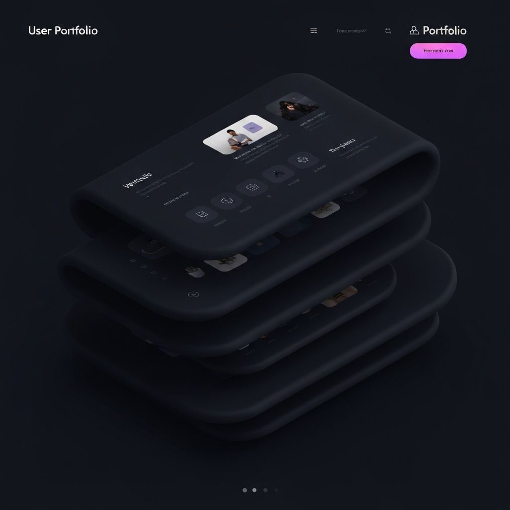
Every coder needs a portfolio, but I didn’t want a grid of projects with polite descriptions. I wanted a space that felt like me—dark, focused, rounded, and intentional. A place where each scroll reveals care and each interaction carries a little momentum.
Designing the Vibe
I chose dark mode for depth and focus, paired with soft radii and balanced spacing to create calm. Color is deliberate and limited—one strong primary, a few neutrals, and a subtle accent. Typography does the heavy lifting with clear hierarchy and generous line height.
Motion is functional: reveal content, guide attention, and reward interaction. No fireworks—just choreography.
Tools Behind the Portfolio
I use Next.js App Router for structure, shadcn/ui for consistent primitives, and small custom components for brand details. I keep assets optimized, use semantic HTML for accessibility, and rely on design tokens for predictable theming.
The result is a system I can evolve with confidence as my work grows.
Identity Over Inventory
A portfolio shouldn’t be a catalog—it should be a statement. It should show what you can do, but more importantly, who you are. Mine is a living space where craft, restraint, and energy meet.
If that resonates, welcome in.